Website

Writing about pages that people actually want to read

Let’s be honest—most “About” pages are boring. They’re filled with stiff bios, vague mission statements, and timelines no one asked for. But the truth is, the About page is often one of the most visited parts of a website. People click on it because they’re curious. They want to know who’s behind the brand, what you stand for, and whether they can trust you. If all they get is a wall of text or corporate speak, they’ll bounce. Fast.

Make It Personal, Make It Useful
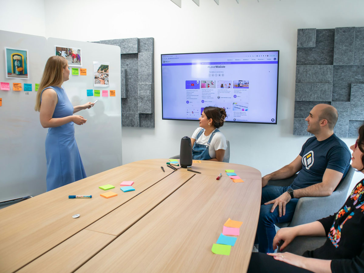
A great About page feels like a conversation, not a pitch. Talk about what led you to start what you’re doing—but keep it relevant. Tie your story back to your audience: how does your background help them? What do you believe in? What makes you different? Add some personality. A photo, a few behind-the-scenes details, or a story that shows your values can go a long way.
And don’t forget the basics: who you are, what you do, where you’re based (if relevant), and how people can connect with you next. If someone finishes your About page feeling like they get you—that’s a win.
Avoid the Fluff, Focus on Connection
Skip the jargon and “passion for excellence” lines. They don’t mean much. Instead, write like a real person. Keep the tone conversational and simple—imagine explaining what you do to someone you just met at a coffee shop. If humor or quirkiness is part of your brand, let it shine. If you’re more serious or mission-driven, stay grounded in authenticity. Real connection comes from being relatable. Share challenges, turning points, or lessons learned along the way. These human moments are what make your story memorable—and help people trust you.
Guide the Reader, Don’t Leave Them Hanging

Once someone connects with your story, what should they do next? Add a simple call to action at the end of the page. That could be inviting them to view your work, sign up for your newsletter, or get in touch. Your About page shouldn’t just inform—it should guide.

In the end, writing a strong About page is less about showing off credentials and more about showing up as you. When done right, it builds trust, loyalty, and turns visitors into fans.

Continue Reading

Dark vs. Light Mode: What to consider before you choose

Dark mode has become more than just a trend — it’s now a common feature in digital products and websites. But how do you decide whether dark or light mode is the right choice for your project? Beyond aesthetics, the decision can affect user experience, accessibility, and even brand perception.

Before committing to a design direction, here are a few things to keep in mind:
1. User Preference Matters

People love control. Offering a toggle between light and dark modes can enhance UX by giving users the flexibility to choose what’s most comfortable for their eyes or environment.

2. Consider the Content

Dark mode works beautifully for visual-heavy content (like portfolios or media sites), but it can strain readability if your site is content-driven. Long-form text often benefits from light backgrounds and high contrast.

It is in the contrast of light and dark that design happens.

Helen Van Wyk

American painter, author and art instructor
Consistency across your UI is key. If you go dark, make sure elements like buttons, icons, and illustrations are adjusted accordingly — it’s not just about flipping the background color.

Another important factor is your brand identity. Light and dark modes can evoke very different emotions. A dark theme might feel sleek and modern, while a light one feels open and clean. Think about what aligns best with your voice, audience, and message.

When done thoughtfully, offering both modes can create a more inclusive, personalized experience. Just remember: it’s not about choosing the trendiest option — it’s about supporting your users the best way possible.

Continue Reading

7 essential elements every modern website should have

Building a website today means meeting user expectations while standing out in a crowded digital landscape. Whether you’re creating a personal site or a business platform, certain elements have become essential to ensure your visitors have a smooth and engaging experience. Here are 7 must-have components every modern website should include:

1. Responsive Design

With over half of web traffic coming from mobile devices, your website must look and function perfectly across all screen sizes — from smartphones to large desktop monitors. Responsive design ensures your content adjusts fluidly, providing a seamless experience for everyone.

2. Clear Navigation

Visitors should never feel lost. A simple, intuitive navigation menu helps users find what they need quickly. Consider sticky menus or hamburger icons for mobile to maintain easy access to key pages.

3. Fast Load Times

Speed matters. Studies show users expect pages to load in under 3 seconds. Compress images, minimize code, and leverage caching to keep your site swift and responsive.

4. Strong Calls to Action (CTAs)

Whether it’s “Contact Me,” “Buy Now,” or “Learn More,” CTAs guide visitors toward your site’s goals. Make them visible, clear, and compelling to increase engagement and conversions.

5. Engaging Visuals
High-quality images, videos, and graphics draw attention and communicate your brand story better than words alone. Use visuals purposefully to support your content and keep visitors interested.
6. Contact Information
Make it easy for visitors to reach out. Include contact forms, email addresses, phone numbers, or social media links. Transparency builds trust and opens doors for new opportunities.
7. SEO Basics

A beautiful site won’t help if no one finds it. Use proper headings, meta descriptions, alt text for images, and optimized URLs to improve your search engine ranking and attract organic traffic.

Wrapping Up

Incorporating these 7 essential elements will set a solid foundation for your website. Remember, a modern site isn’t just about looks — it’s about delivering value through great design, usability, and performance. Keep your visitors in mind, and you’ll create an experience worth coming back to.

Continue Reading

Building a website that actually stands out

In today’s saturated digital world, having a website isn’t enough — having a memorable one is what sets you apart. Whether you’re a freelancer, creative, or business owner, your website is often the first impression people get of your work. So, how do you create something that doesn’t just look good, but sticks with people?

Here are some key principles to help your website truly stand out:

1. Start with a Clear Purpose

What is your website trying to achieve? Is it to showcase your portfolio? Sell a service? Grow a personal brand? Clarity in purpose shapes everything — layout, content, flow, and even the tone of your writing.

2. Embrace Simplicity

Minimal doesn’t mean boring. It means intentional. Strip away the unnecessary, and focus on what truly matters. Let your message, work, or product breathe — and guide the user with clean, simple navigation.

3. Use Unique Visual Language

Your website should feel like you. Thoughtful use of color, typography, animation, and white space can give your site its own identity. Avoid generic templates and focus on making design choices that reflect your personality or brand.

4. Prioritize UX and Speed

No matter how beautiful your site is, if it’s slow or hard to use, people will leave. Optimize for fast load times, mobile responsiveness, and intuitive user flows. Tools like Lighthouse or GTmetrix can help you test and improve performance.

5. Tell a Story

People connect with people. Use your About page, project case studies, or blog to share your journey, your thought process, or what inspires your work. Storytelling makes your site memorable and relatable.

6. Keep It Fresh

A stagnant website feels outdated. Even small updates — a new blog post, updated project, or recent client — can keep your site feeling alive and active. It also helps with SEO and return visitors.

Conclusion

A standout website is more than flashy visuals. It’s a well-thought-out experience that reflects who you are, what you offer, and why it matters. Design with purpose, speak with clarity, and always keep the user in mind — that’s how you build something that truly lasts.

Continue Reading