Trends

Fresh design trends to watch this year

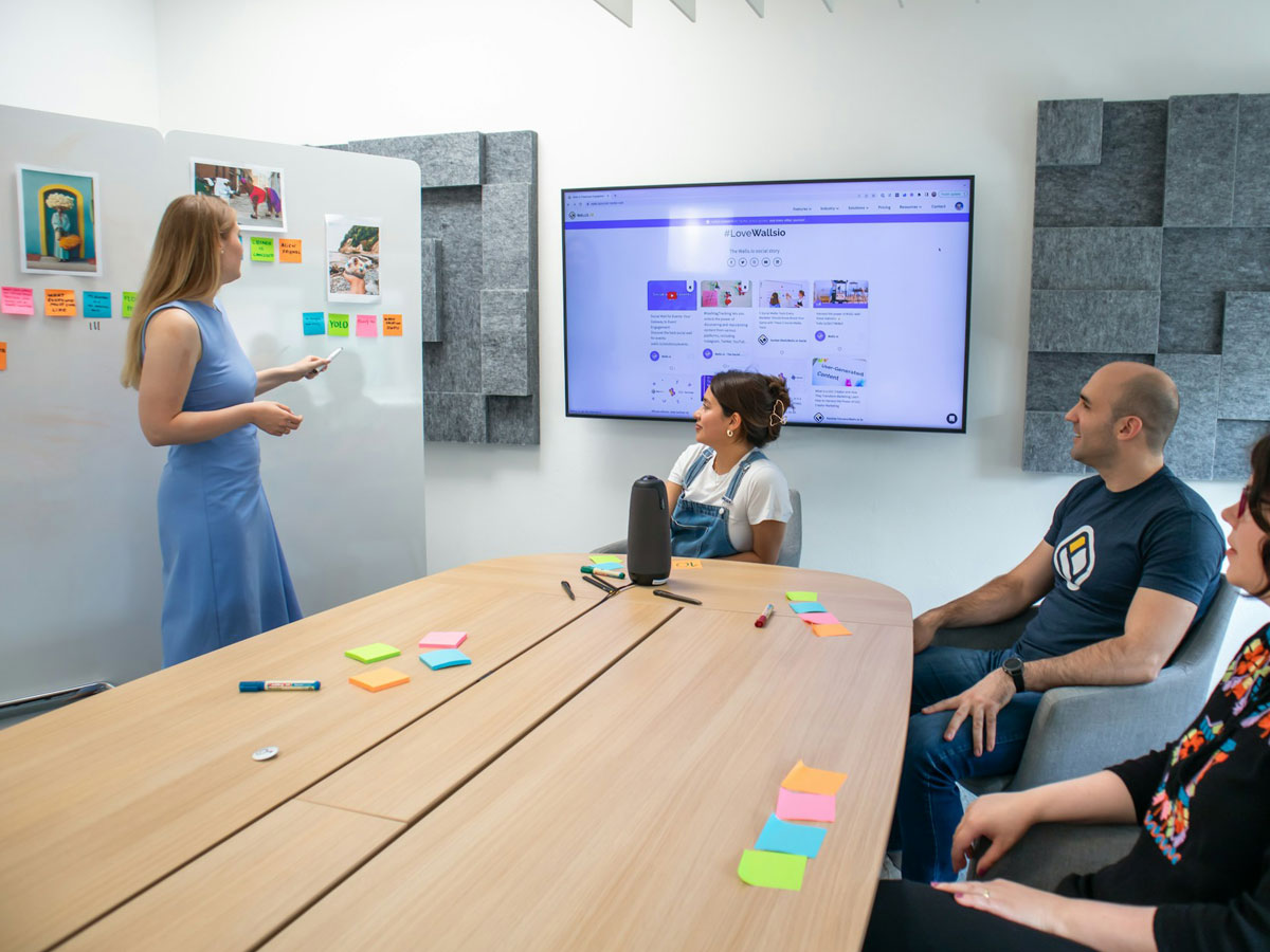
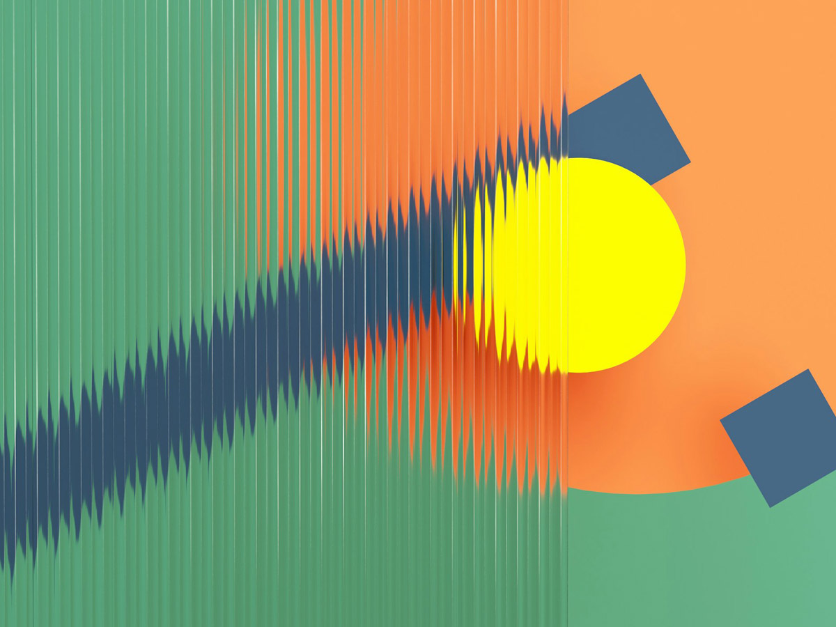
Every year brings a new wave of creativity in the world of design, and this one is no different. As digital spaces continue to evolve, designers are leaning into bold experimentation, thoughtful minimalism, and immersive user experiences. One major trend gaining traction is neo-brutalism, a style that embraces raw, unpolished visuals with bold typography, high contrast, and asymmetrical layouts. It’s a reaction to overly polished interfaces, bringing a sense of authenticity and visual tension. Alongside this, claymorphism and 3D elements are making a comeback—offering a soft, tactile feel that adds depth and playfulness to UI. These styles help brands stand out by creating a more human, engaging look.

Another key trend is the use of microinteractions and purposeful motion. Designers are using subtle animations to guide users, improve usability, and inject personality into interfaces—without overwhelming the experience. At the same time, AI tools are being used to speed up workflows and generate design suggestions, freeing designers to focus more on concept and strategy. We’re also seeing a continued push for accessible, inclusive design, with WCAG standards influencing everything from color choices to navigation patterns. In short, 2025 is about designing smarter, with a focus on clarity, personality, and user-first thinking—blending innovation with intentionality.

Highlighting the fresh design trends to watch this year:

Neo-Brutalism

Raw, unpolished visuals with bold typography, high contrast, and asymmetrical layouts. It embraces authenticity and breaks away from overly polished designs.

Claymorphism & 3D Elements

Soft, tactile shapes with shadows and depth that create a playful, engaging user interface. Great for adding personality and a human touch to digital products.

Microinteractions & Purposeful Motion

Subtle animations that guide users, enhance usability, and add personality without being distracting.

AI-Enhanced Design Tools

Tools that help designers generate ideas, automate tasks, and speed up workflows—letting them focus more on creativity and strategy.

These trends reflect a move toward more expressive, human-centered digital experiences in 2025—where innovation meets thoughtful design.

Continue Reading

5 timeless design principles that still work in 2025

Design trends come and go, but some principles are immune to the clock. As we navigate AI-assisted creativity, spatial interfaces, and hyper-personalized experiences, these five timeless design principles continue to ground great design in 2025:

Here are some key principles to help your website truly stand out:

1. Clarity Over Cleverness

No matter the medium—app, site, or wearable—clear communication always wins. Users still favor intuitive experiences over flashy complexity.

2. Hierarchy is Everything

Visual hierarchy guides attention. From typography to layout, prioritizing information ensures users never feel lost—even in immersive environments.

3. Consistency Builds Trust
Whether it’s micro-interactions or voice UI responses, a consistent design language fosters familiarity and confidence in your product.
4. Empathy Drives Innovation

Technology evolves, but understanding your user’s context, needs, and emotions is still the north star of impactful design.

5. Less, but Better
Dieter Rams said it decades ago, and it’s still true: minimalism with intention isn’t about doing less—it’s about making every element count.
As we build for a world filled with smart assistants and augmented layers, these principles remind us: great design isn’t just future-forward—it’s human-first.

Continue Reading

7 essential elements every modern website should have

Building a website today means meeting user expectations while standing out in a crowded digital landscape. Whether you’re creating a personal site or a business platform, certain elements have become essential to ensure your visitors have a smooth and engaging experience. Here are 7 must-have components every modern website should include:

1. Responsive Design

With over half of web traffic coming from mobile devices, your website must look and function perfectly across all screen sizes — from smartphones to large desktop monitors. Responsive design ensures your content adjusts fluidly, providing a seamless experience for everyone.

2. Clear Navigation

Visitors should never feel lost. A simple, intuitive navigation menu helps users find what they need quickly. Consider sticky menus or hamburger icons for mobile to maintain easy access to key pages.

3. Fast Load Times

Speed matters. Studies show users expect pages to load in under 3 seconds. Compress images, minimize code, and leverage caching to keep your site swift and responsive.

4. Strong Calls to Action (CTAs)

Whether it’s “Contact Me,” “Buy Now,” or “Learn More,” CTAs guide visitors toward your site’s goals. Make them visible, clear, and compelling to increase engagement and conversions.

5. Engaging Visuals
High-quality images, videos, and graphics draw attention and communicate your brand story better than words alone. Use visuals purposefully to support your content and keep visitors interested.
6. Contact Information
Make it easy for visitors to reach out. Include contact forms, email addresses, phone numbers, or social media links. Transparency builds trust and opens doors for new opportunities.
7. SEO Basics

A beautiful site won’t help if no one finds it. Use proper headings, meta descriptions, alt text for images, and optimized URLs to improve your search engine ranking and attract organic traffic.

Wrapping Up

Incorporating these 7 essential elements will set a solid foundation for your website. Remember, a modern site isn’t just about looks — it’s about delivering value through great design, usability, and performance. Keep your visitors in mind, and you’ll create an experience worth coming back to.

Continue Reading