Design

Design smarter, Not harder: Workflow hacks for creatives

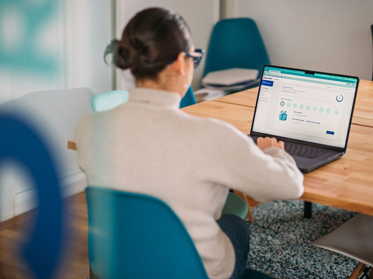
Designing and developing a website can be a time-consuming process — especially if you’re juggling multiple projects or trying to balance creativity with deadlines. The good news? You don’t need to work harder to achieve better results. With a few workflow tweaks, you can streamline your process, stay focused, and create better work in less time.

Start with Systems, Not Blank Screens

One of the biggest productivity killers is starting from scratch every time. Instead, build or use design systems, component libraries, or pre-built frameworks. Whether you work in Figma or code in a modern stack, having reusable UI blocks, templates, or grid setups can save hours across every project. This doesn’t mean cookie-cutter design — it means smart reuse of good foundations.

Planning ahead also makes a huge difference. Before diving into visuals, outline the structure, goals, and user needs. A solid discovery process ensures you’re not redesigning mid-project — it helps you design with clarity and purpose from the beginning.

Automate, Optimize, and Focus on What Matters
Take advantage of tools that automate the repetitive stuff. Plugins for compressing assets, auto-formatting code, or syncing design tokens can keep your workflow clean without extra effort. Use version control (like Git) and cloud collaboration to avoid chaos and lost progress.

Most importantly, focus on the tasks that deliver real value. Don’t waste hours obsessing over the perfect shade of gray — focus on solving real user problems, refining flows, and building intuitive interfaces. That’s what separates good design from great design. Streamlining your workflow isn’t about cutting corners — it’s about building smarter habits that help you stay creative without burning out. Small changes, consistently applied, make a big difference in how you work and what you produce.

Continue Reading

Fresh design trends to watch this year

Every year brings a new wave of creativity in the world of design, and this one is no different. As digital spaces continue to evolve, designers are leaning into bold experimentation, thoughtful minimalism, and immersive user experiences. One major trend gaining traction is neo-brutalism, a style that embraces raw, unpolished visuals with bold typography, high contrast, and asymmetrical layouts. It’s a reaction to overly polished interfaces, bringing a sense of authenticity and visual tension. Alongside this, claymorphism and 3D elements are making a comeback—offering a soft, tactile feel that adds depth and playfulness to UI. These styles help brands stand out by creating a more human, engaging look.

Another key trend is the use of microinteractions and purposeful motion. Designers are using subtle animations to guide users, improve usability, and inject personality into interfaces—without overwhelming the experience. At the same time, AI tools are being used to speed up workflows and generate design suggestions, freeing designers to focus more on concept and strategy. We’re also seeing a continued push for accessible, inclusive design, with WCAG standards influencing everything from color choices to navigation patterns. In short, 2025 is about designing smarter, with a focus on clarity, personality, and user-first thinking—blending innovation with intentionality.

Highlighting the fresh design trends to watch this year:

Neo-Brutalism

Raw, unpolished visuals with bold typography, high contrast, and asymmetrical layouts. It embraces authenticity and breaks away from overly polished designs.

Claymorphism & 3D Elements

Soft, tactile shapes with shadows and depth that create a playful, engaging user interface. Great for adding personality and a human touch to digital products.

Microinteractions & Purposeful Motion

Subtle animations that guide users, enhance usability, and add personality without being distracting.

AI-Enhanced Design Tools

Tools that help designers generate ideas, automate tasks, and speed up workflows—letting them focus more on creativity and strategy.

These trends reflect a move toward more expressive, human-centered digital experiences in 2025—where innovation meets thoughtful design.

Continue Reading

Dark vs. Light Mode: What to consider before you choose

Dark mode has become more than just a trend — it’s now a common feature in digital products and websites. But how do you decide whether dark or light mode is the right choice for your project? Beyond aesthetics, the decision can affect user experience, accessibility, and even brand perception.

Before committing to a design direction, here are a few things to keep in mind:
1. User Preference Matters

People love control. Offering a toggle between light and dark modes can enhance UX by giving users the flexibility to choose what’s most comfortable for their eyes or environment.

2. Consider the Content

Dark mode works beautifully for visual-heavy content (like portfolios or media sites), but it can strain readability if your site is content-driven. Long-form text often benefits from light backgrounds and high contrast.

It is in the contrast of light and dark that design happens.

Helen Van Wyk

American painter, author and art instructor
Consistency across your UI is key. If you go dark, make sure elements like buttons, icons, and illustrations are adjusted accordingly — it’s not just about flipping the background color.

Another important factor is your brand identity. Light and dark modes can evoke very different emotions. A dark theme might feel sleek and modern, while a light one feels open and clean. Think about what aligns best with your voice, audience, and message.

When done thoughtfully, offering both modes can create a more inclusive, personalized experience. Just remember: it’s not about choosing the trendiest option — it’s about supporting your users the best way possible.

Continue Reading

Building a website that actually stands out

In today’s saturated digital world, having a website isn’t enough — having a memorable one is what sets you apart. Whether you’re a freelancer, creative, or business owner, your website is often the first impression people get of your work. So, how do you create something that doesn’t just look good, but sticks with people?

Here are some key principles to help your website truly stand out:

1. Start with a Clear Purpose

What is your website trying to achieve? Is it to showcase your portfolio? Sell a service? Grow a personal brand? Clarity in purpose shapes everything — layout, content, flow, and even the tone of your writing.

2. Embrace Simplicity

Minimal doesn’t mean boring. It means intentional. Strip away the unnecessary, and focus on what truly matters. Let your message, work, or product breathe — and guide the user with clean, simple navigation.

3. Use Unique Visual Language

Your website should feel like you. Thoughtful use of color, typography, animation, and white space can give your site its own identity. Avoid generic templates and focus on making design choices that reflect your personality or brand.

4. Prioritize UX and Speed

No matter how beautiful your site is, if it’s slow or hard to use, people will leave. Optimize for fast load times, mobile responsiveness, and intuitive user flows. Tools like Lighthouse or GTmetrix can help you test and improve performance.

5. Tell a Story

People connect with people. Use your About page, project case studies, or blog to share your journey, your thought process, or what inspires your work. Storytelling makes your site memorable and relatable.

6. Keep It Fresh

A stagnant website feels outdated. Even small updates — a new blog post, updated project, or recent client — can keep your site feeling alive and active. It also helps with SEO and return visitors.

Conclusion

A standout website is more than flashy visuals. It’s a well-thought-out experience that reflects who you are, what you offer, and why it matters. Design with purpose, speak with clarity, and always keep the user in mind — that’s how you build something that truly lasts.

Continue Reading